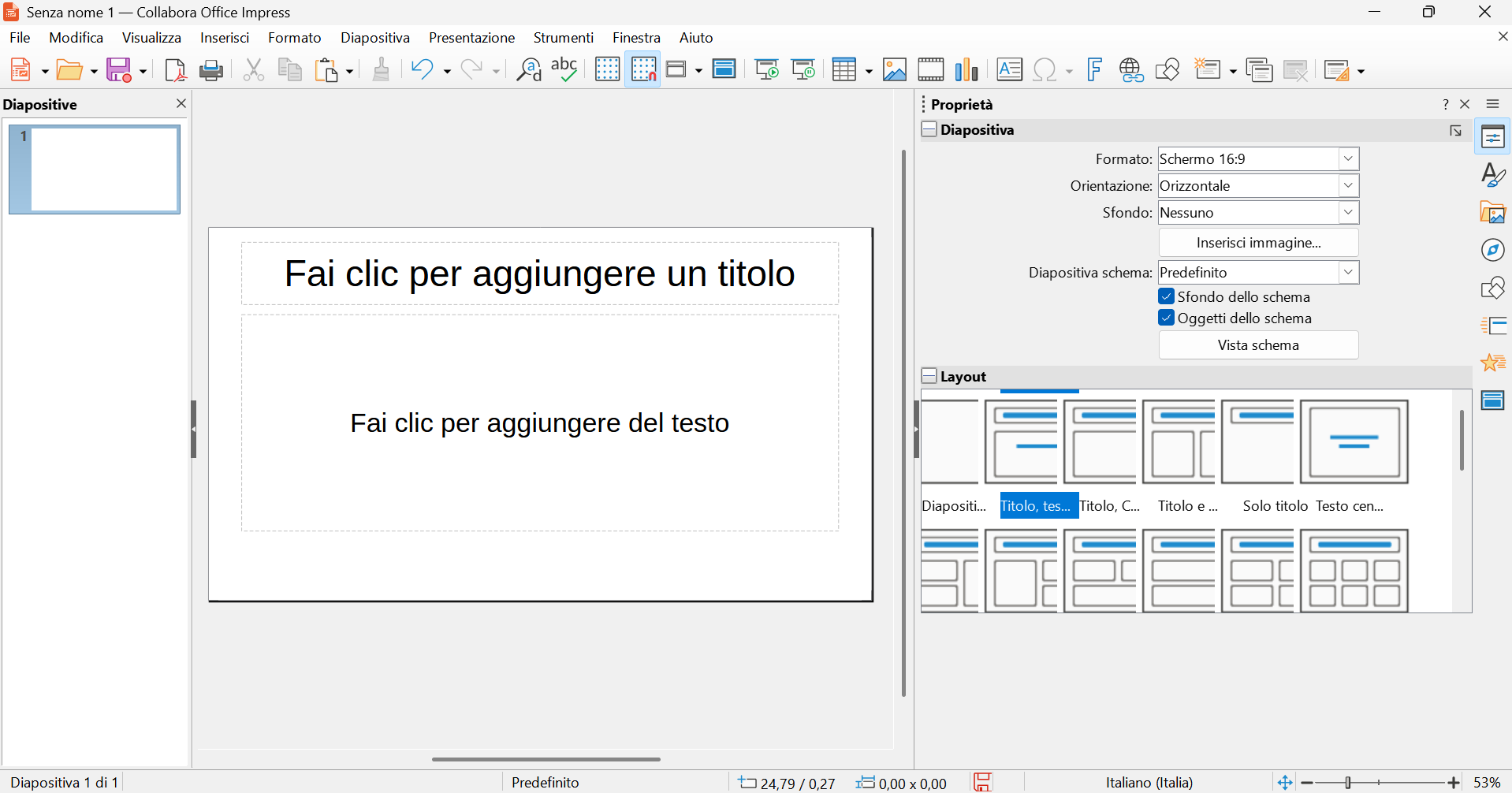
Hi, after the latest update in Impress, unfortunately, the tab layout in the sidebar looks like the screenshot I’ve attached.
It’s unclear and confusing.
The card examples overlap and the selection is confusing.
Is this normal, or is it a bug?
Thank you so much!
Hi, I hope the regression is resolved soon.
I work with your products and I’m really happy with them.
However, if I may make an observation, without being polemical, I wonder why a problem like the one I encountered wasn’t identified before the latest version was released.
Collabora Office is a product that should be more stable and reliable than the continuously released versions of LO, precisely because it’s for users who use it for work.
A regression like the one I encountered isn’t a hidden bug or something difficult to detect, but rather a clear issue that perhaps could have been easily identified before the release.
Again, I don’t want to be polemical; it’s just my opinion.
I’d also like to be able to contribute a little with my observations, and I hope I’m not a bother.
In any case, I discovered that the regression doesn’t occur on my second PC (with Windows 10) (maybe this information can help you).
Thank you again for your software, and I look forward to a solution soon.